
Virnoux
Created by two physician-scientists, Virnoux is a male fertility supplement formulated to help men improve sperm quality and DNA health. A product this personal — built for men navigating one of life’s most meaningful journeys — needed a brand built on respect, nuance, and genuine emotional intelligence.
Early in our BrandScript process, a key insight emerged: the real product Virnoux delivers isn’t improved sperm health. It’s the chance to become a parent. That emotional truth became the foundation for everything — a brand built to feel optimistic, trustworthy, and quietly confident.
At Hardy Branding + Design, we believe in brands that contribute to a life well-lived. Few things speak to that more directly than the journey to becoming a parent — and few challenges demonstrate the value of nuanced brand strategy more clearly than getting that story right.
Project Specs
Project Type Brand Strategy (BrandSync™)
Services Marketing Strategy, Brand Strategy, Logo Design, Website Design, Label Design, Ad Copy & Design, Print Design, Video Production
Brand Scapes
Once the BrandScript process clarifies a brand’s voice and story, the BrandScape translates it into a visual identity — exploring color, typography, photography direction, and graphic style to find the right visual language.
For Virnoux, the strategic goal was clear: build a visual identity that balanced scientific credibility with genuine emotional warmth. Three directions were explored.
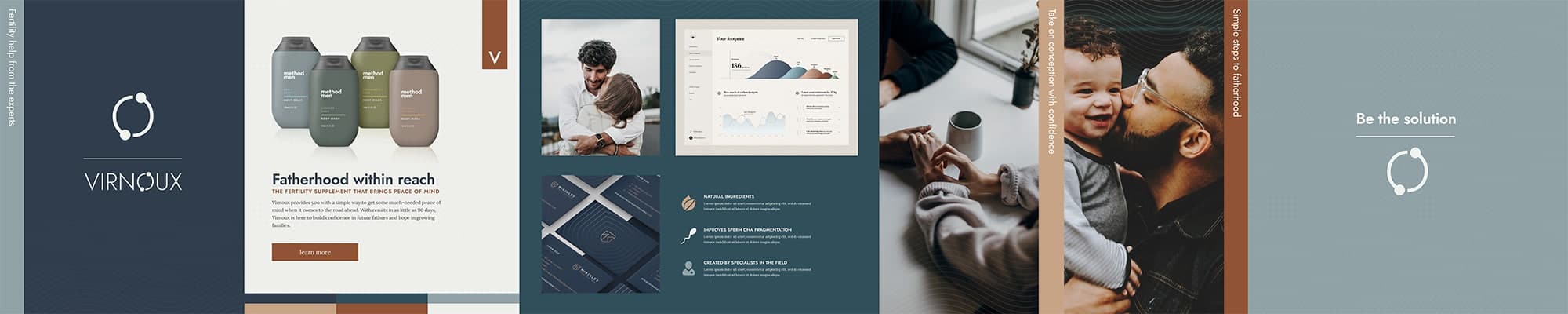
Option 1
Trust and emotional connection were the primary goals — especially important for a product tied to something as personal as fertility. A confident, comforting color palette was paired with photography focused on the relationships that matter most throughout a journey to fatherhood.
Option 2
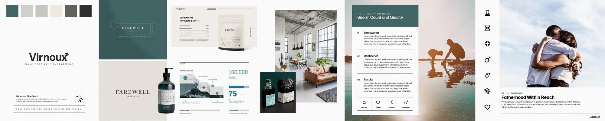
Where Option 1 leaned into comfort, Option 2 leaned into science — a striped back palette that builds trust through the scientific authority of the formula. This was intended to be a very straightforward approach.
Option 3
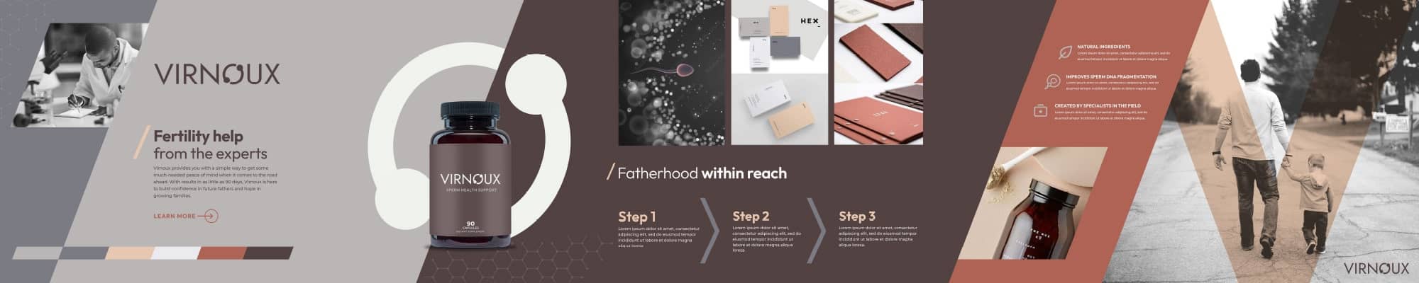
The chosen direction brought together the best of both — the warmth of Option 1 and the scientific credibility of Option 2. The color palette speaks to the brand’s male audience while communicating the quality the product deserves. Diagonal lines throughout the design bring a modern vibe and create a sense of forward momentum — a subtle visual metaphor for the progress Virnoux provides.
Label Design
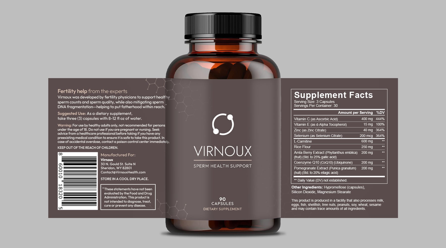
The label design evolved directly from the selected BrandScape. A hexagonal pattern was added to reinforce the scientific precision of the formula while adding visual texture and depth. The logo was adapted to a stacked configuration to optimize the front-facing display on the selected bottle shape — a small adjustment with a significant impact on shelf presence.
Click on image to scale
Logo Design
The Virnoux logo was designed to communicate progress. The custom “cycle” symbol represents forward momentum — and serves as a subtle visual reference to the healthy sperm motility the product supports. Clean, confident, and built to work across every application from label to digital.
Stacked Version

Horizontal Version
Video Production
To launch Virnoux, we produced a brand commercial that brought the visual identity to life in motion — inspiring graphics, purposeful pacing, and music that matched the brand’s optimistic tone. Every frame was built from the BrandScape guidelines, ensuring the launch video felt like a natural extension of the brand rather than a standalone piece.