DROST LANDSCAPE
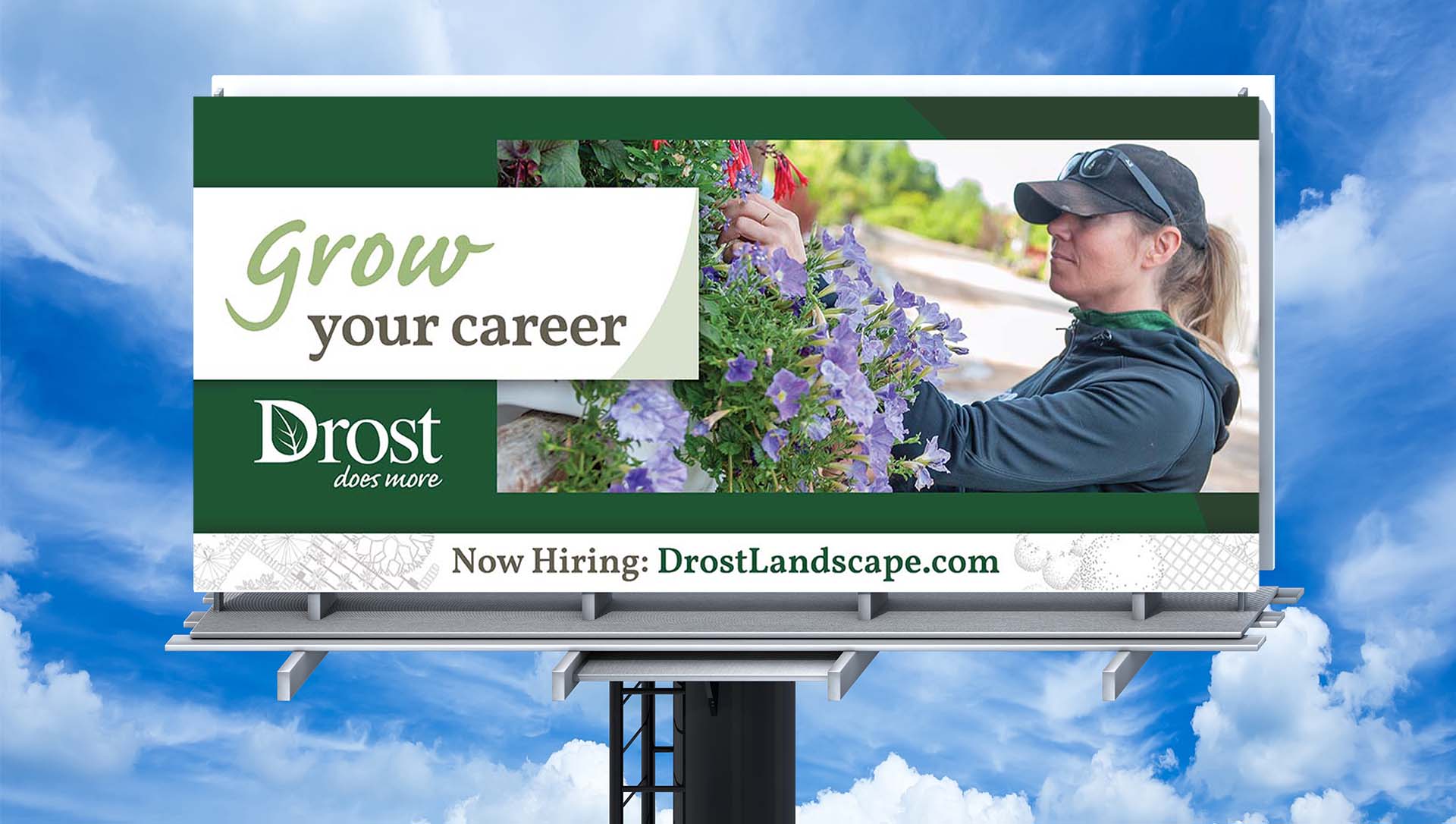
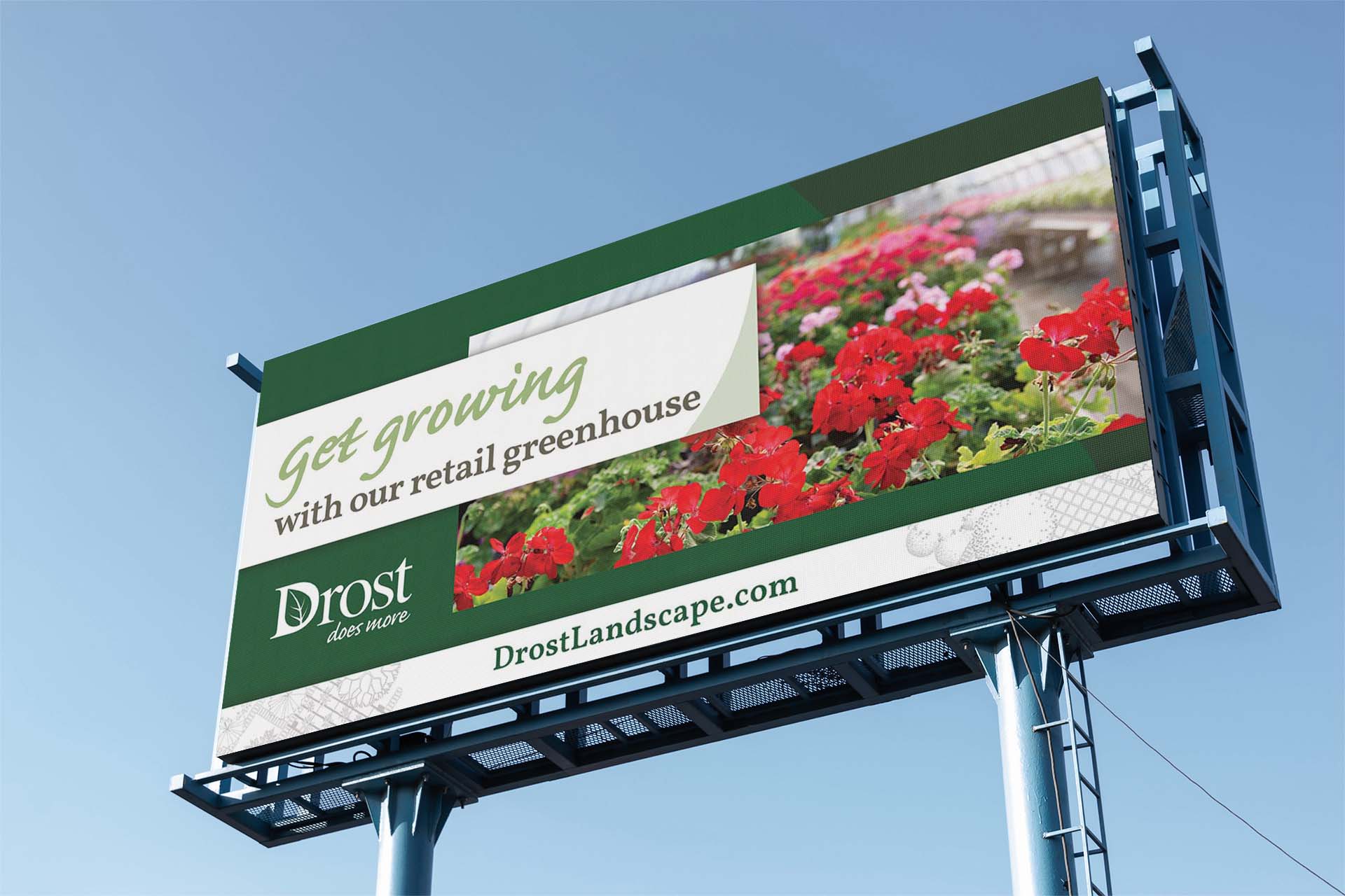
Drost Landscape was looking for a brand refresh to help make the company feel more modern as well as more comprehensive in ways they can serve customers. We set out to design and develop a new website, as well as new campaign centered around this concept.
Click to view the Brand-Scapes that inspired Drost’s re-brand strategy
Project Specs
Project Type: Marketing and Brand Strategy
Services: Marketing Strategy and Execution, Brand Strategy and Execution, Creative Services (Website Design, Ad Copy & Design, Print Design, Signage Design, Photoshoot)
Website Design & Messaging
Showcase the Brand
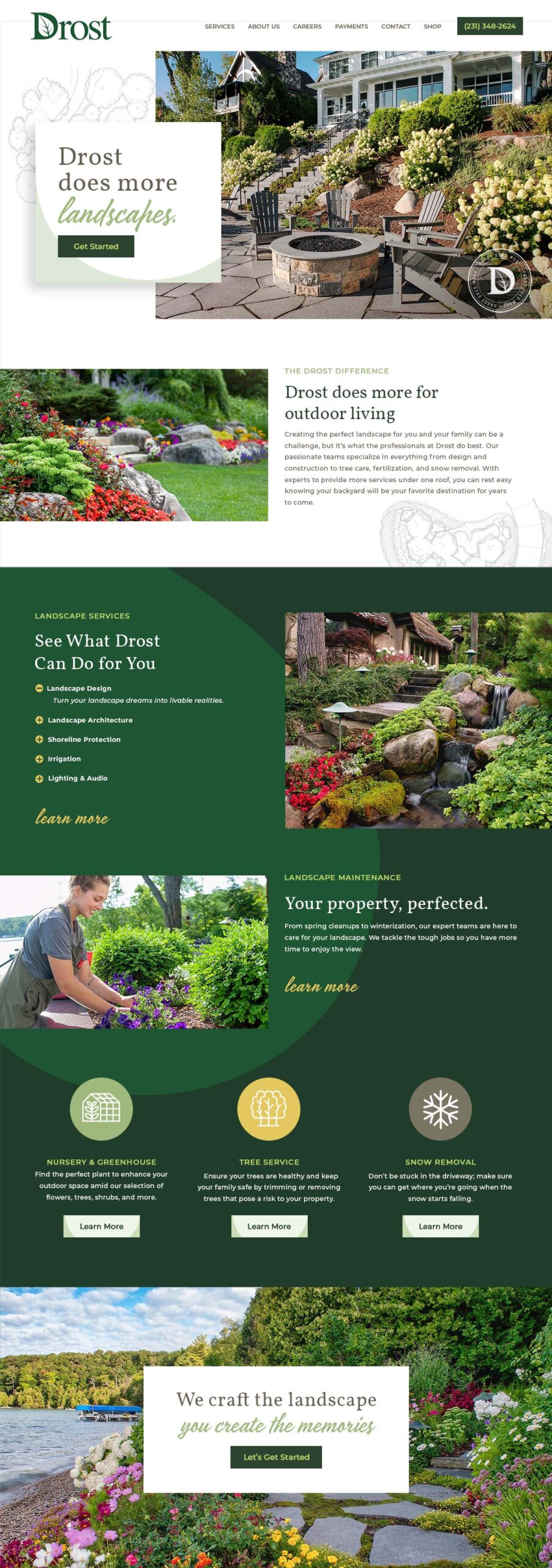
The goal of the website redesign was to accurately reflect the new brand strategy that’s focused on highlighting the services Drost provides, above and beyond landscaping. To help clearly showcase this, an animated intro area rotates through a variety of words to finish off the ‘Drost does more (blank)’ message.
Photography
With work that results in such outstanding visuals, we really wanted to leverage photography in the design, within an artistic design, that allows the photography to work in concert with other elements within the layout.
From Concept to Completion
A key part of the new website design is to better showcase the wide range of beautiful projects Drost creates for their customers. Part of this was working in actual design sketches to visually display how the projects manifest from an initial concept illustration.
Branded Nuance
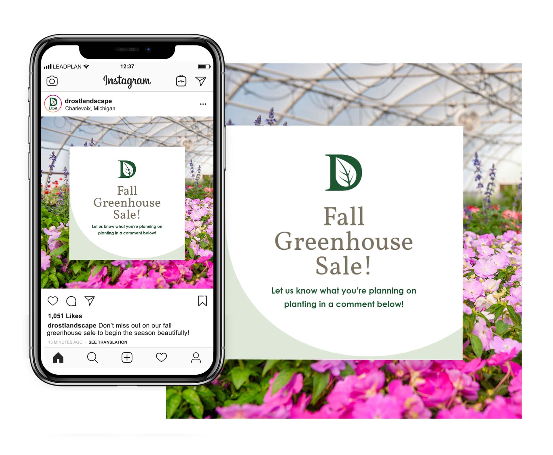
As part of the brand’s evolution, we wanted to work the swoopy leaf shape that can be seen inside the ‘D’ in the Drost logo, into the new website’s design and other marketing materials. It’s a subtle touch that adds movement to the layouts, while also adding a nice touch to the brand’s overall aesthetic.
The Power of Color
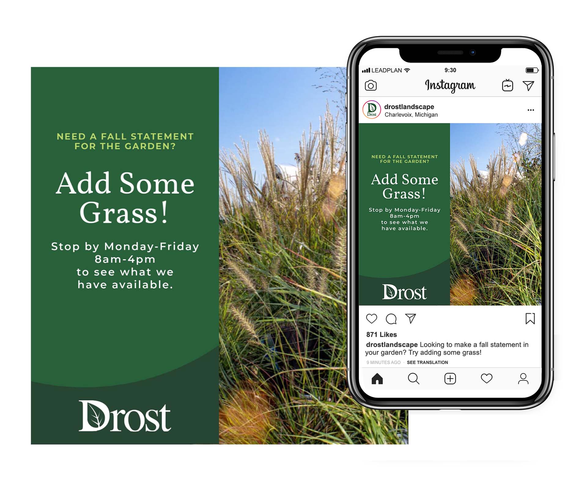
Drost’s brand was typically only seen in 2 colors—green and white. To help infuse a bit more life into the brand, we expanded the color palette to incorporate other natural shades seen in much of their work. The expanded color palette features a darker shade of green to complement the core ‘grass green,’ along with a brighter green for accents, a muted yellow, as well as a deep putty brown (seen in the service icons).
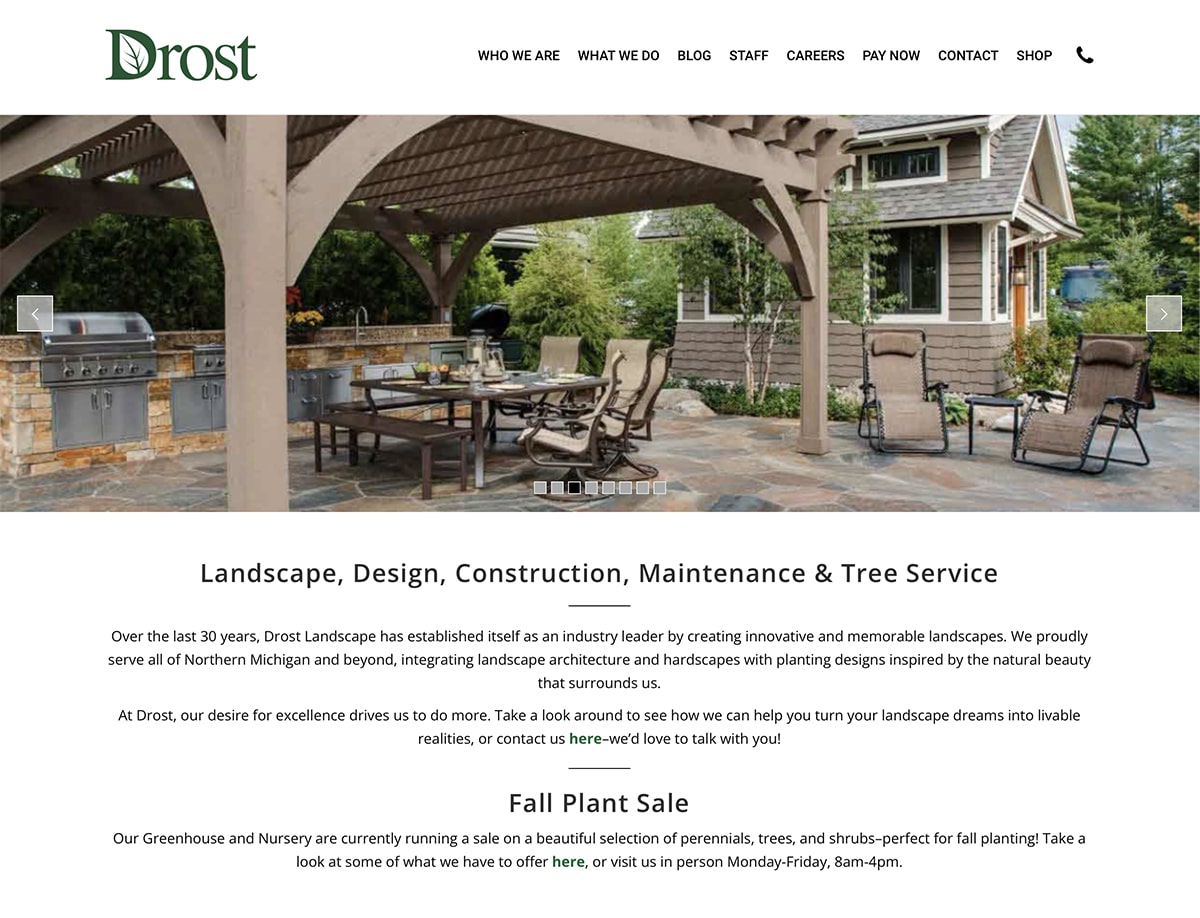
Previous Design
The previous website felt a bit too sterile, lacking emotion, and failed to leave a lasting impression.
(Click image to see full-size)
Brand Message Strategy
To help drive home the concept of ‘Drost does more’ visually, we created a logo version that utilizes the updated brand font strategy along with the bolder, updated brand color palette.
Brand Book
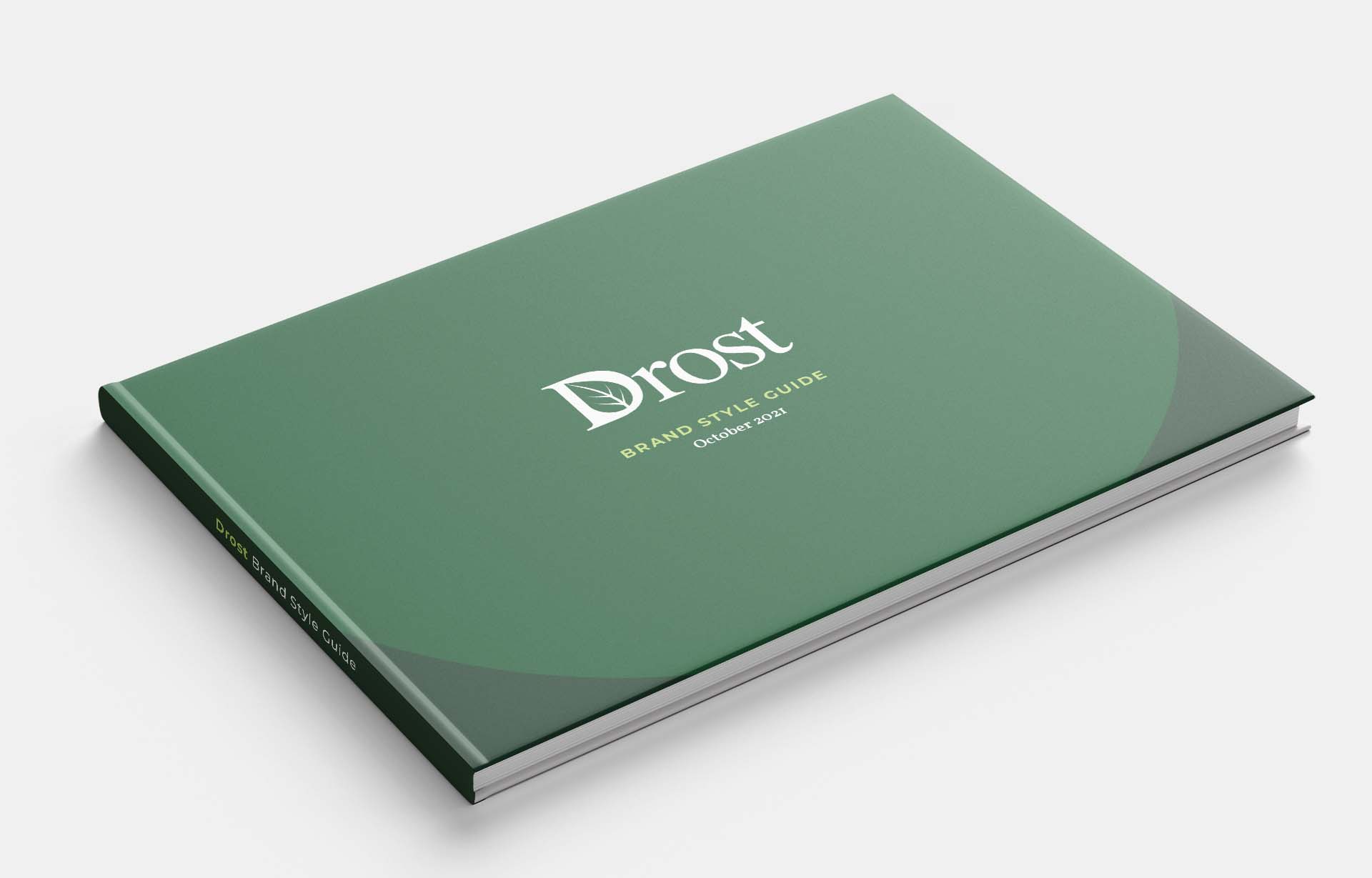
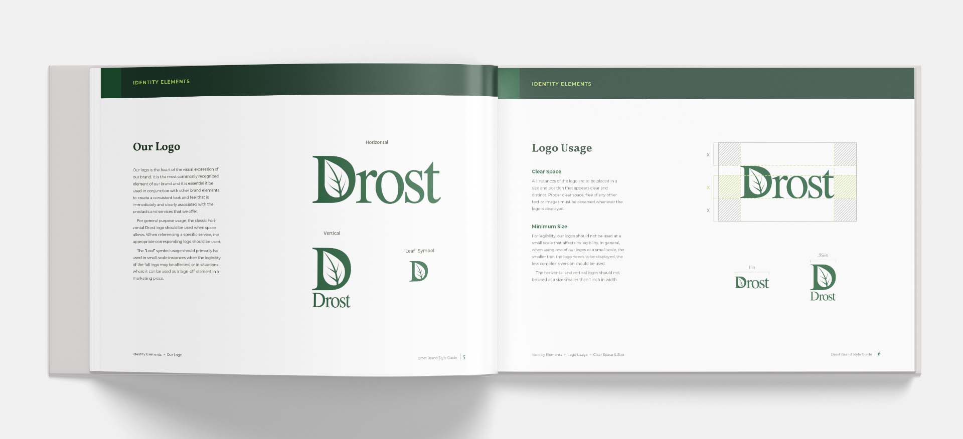
We created a brand book to clearly outline the new brand strategy for both internal team members of Drost Landscape, as well as any vendors hired to perform creative work in the future.
The book’s purpose is to provide guidance on how to implement the new brand strategy, including clear instructions on how and when to use the logo, graphic design elements, fonts, photography,
Click on image to enlarge
Social Media Design
To help Drost’s internal team maintain brand consistency, social media ad templates were created in a software platform their familiar with. The templates allow for easy updates with plug-and-play photography and messaging within designs that match the brand’s new look.
Click on image to enlarge
