
REGARD
We were approached by Regard as they began pursuing a comprehensive brand refresh. As a medical supplies company specializing in nursing and surgical categories, Regard needed an identity that reflected both the reliability of an established healthcare partner and the forward-thinking nature of a growing brand. The challenge was creating a visual and digital experience that felt modern and innovative while still communicating clarity, trust, and professionalism to healthcare providers and decision-makers.
Our goal was to develop a brand experience that simplified complex offerings and positioned Regard as a confident leader within the medical supply industry. From refined messaging to a more elevated visual system, every element was designed to feel approachable, credible, and easy to navigate, helping the brand better connect with its audience while supporting its continued growth.
Project Specs
Client Regard
Project Type Branding
Services Creative Direction, Graphic Design, Illustration, Copywriting
Brandscape
Our Brand-Scape process is used to establish the visual aesthetic when working on brand strategy clients. Once developed, it serves as the cornerstone for the visual elements of the brand.
Note: Use arrows to the left and right or the dots below to slide through images.
Brand Message Strategy
In order to reinforce a sense of confidence, a brand messaging strategy that emphasized the key attributes of “quality” and “safety” along with a firm call-to-action is used throughout many of the brand assets.

Brand Book
We created a brand book to clearly outline the brand strategy for both internal team members of Regard, as well as any vendors hired to perform creative work in the future.
The book’s purpose is to provide guidance on how to implement the new brand strategy, including clear instructions on how and when to use the logo, graphic design elements, fonts, photography, and colors.
Note: Use arrows to the left and right or the dots below to slide through images.
Packaging
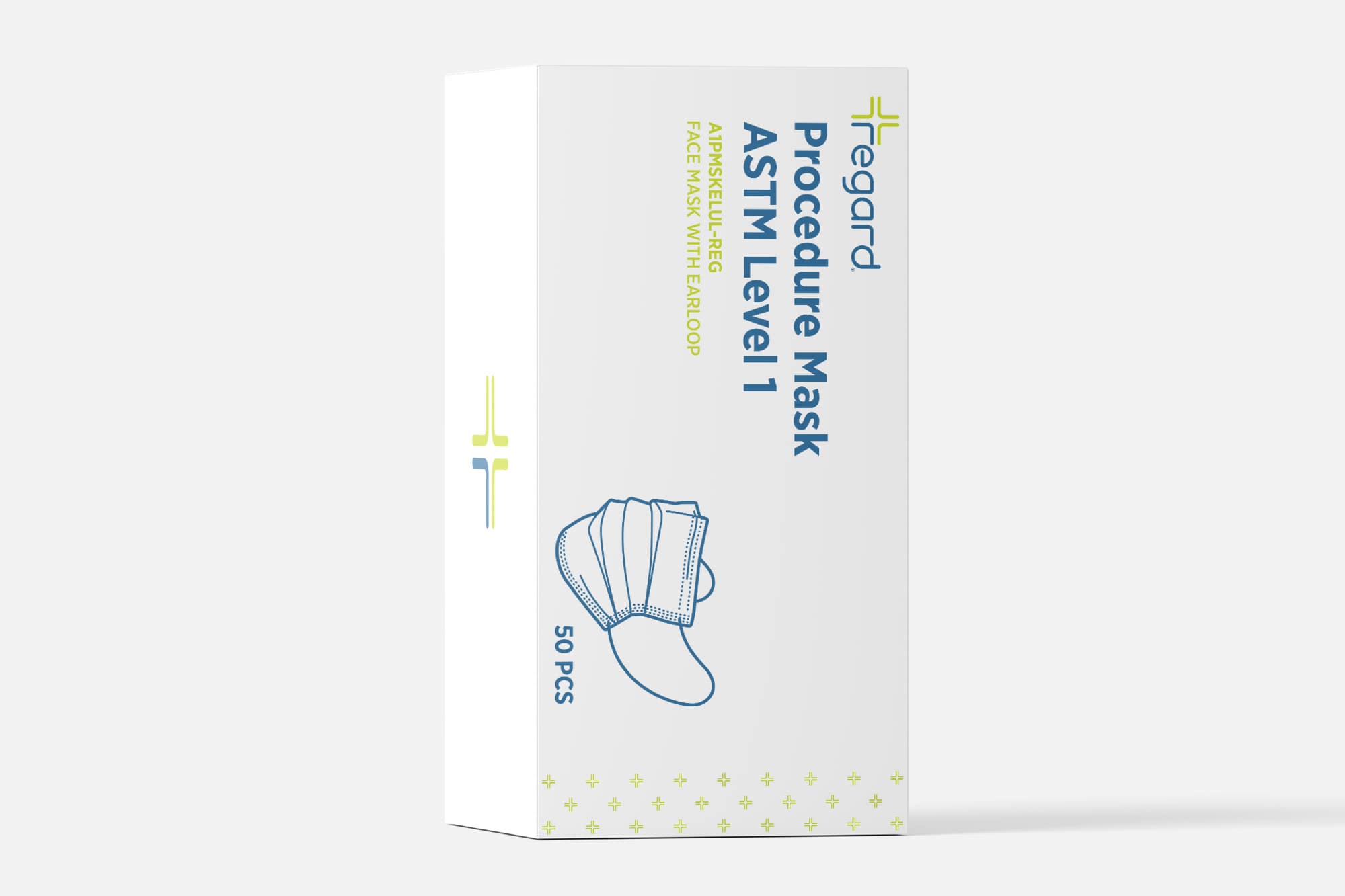
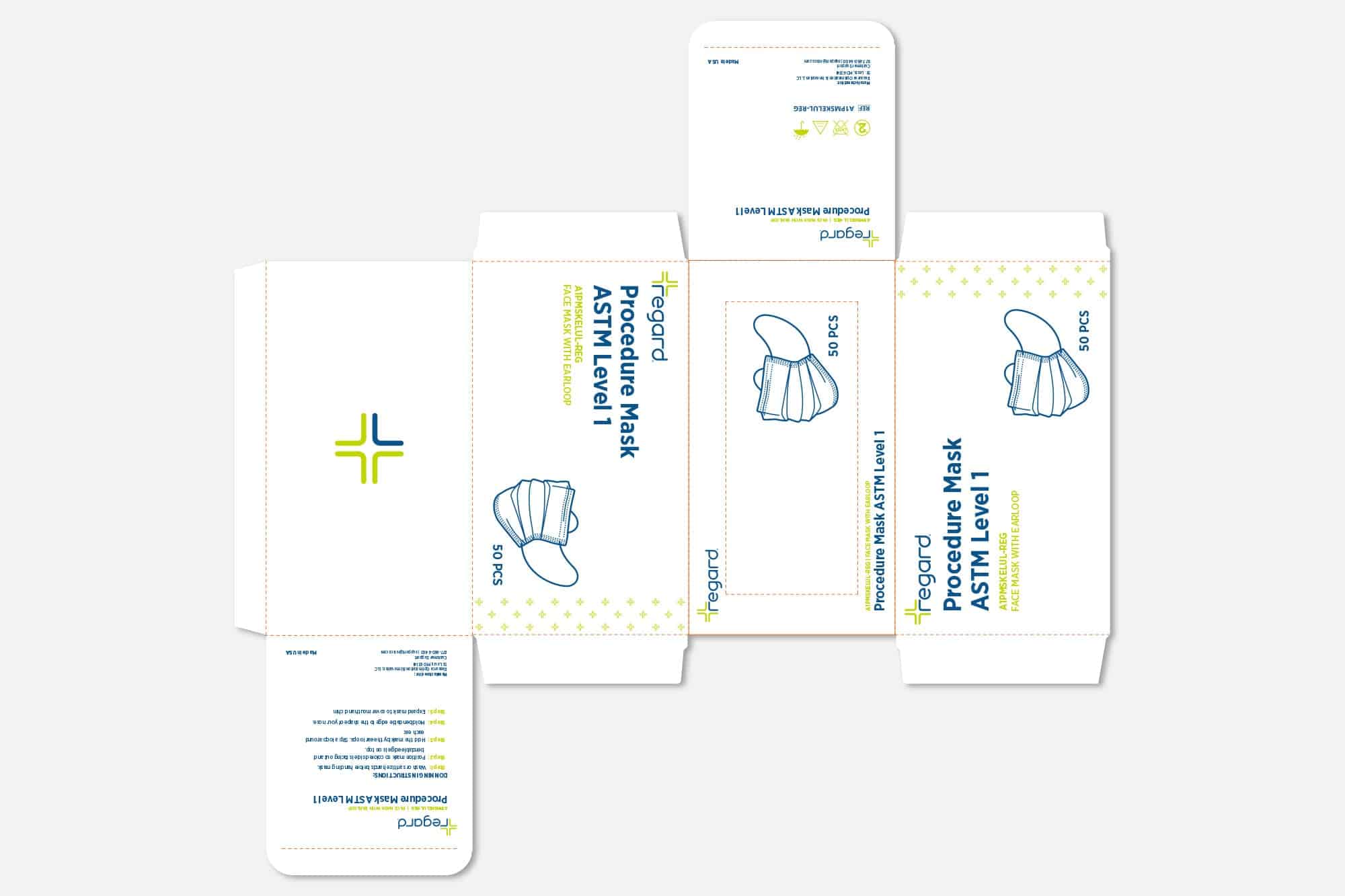
Procedure Mask Box
Click on image to enlarge
Click on image to enlarge
Signage
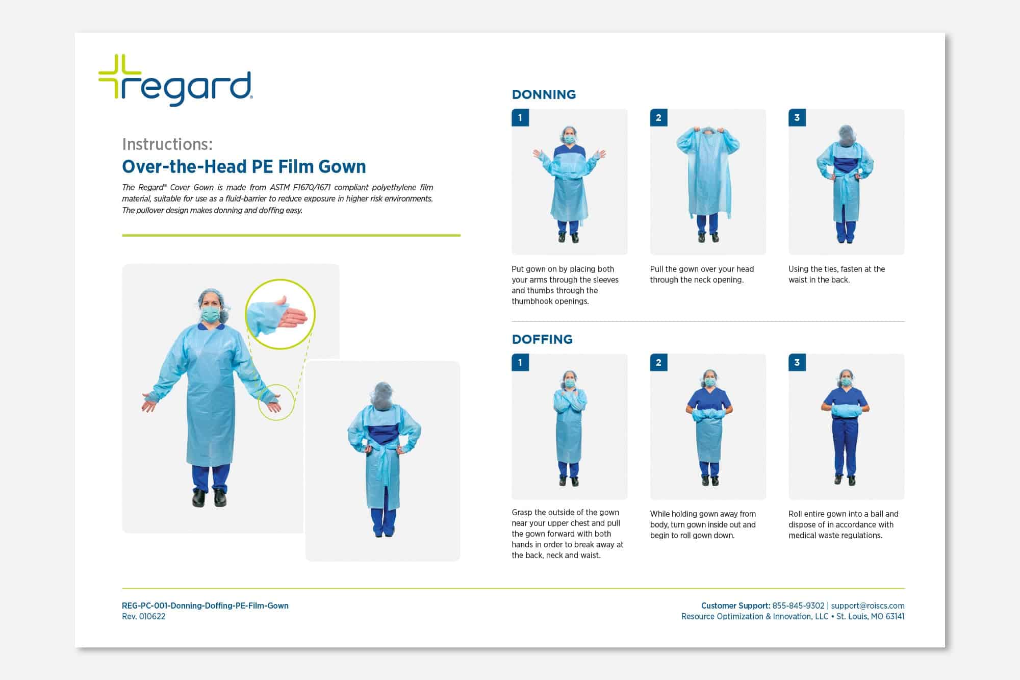
Donning & Doffing Signs
To help clarify how to properly don and doff Regard gowns, informational posters were designed to demonstrate step-by-step instructions both visually and with clear written directions.
Click on image to enlarge